

👋 Hey, Chris here! Welcome to The Founders Corner. If you’ve been reading along, you’ll know I have very little patience for theory that doesn’t survive contact with a real buyer.
This series is a preview of a new book I’ve written with my partners Richard Blundell and Paul Watson — The Selling Software Algorithm: The Go-to-Market Navigation System for B2B Software Leaders.
It isn’t a strategy deck dressed up as a book. Between the three of us we’ve spent close to seven decades inside B2B software as founders, operators, investors and coaches — building companies, exiting some, and quietly breaking a few along the way, which is where most of the real learning lives. Through our work at Vencha we’ve now supported hundreds of founders trying to do the single hardest thing in software: turn a clever product into predictable commercial traction in a market that’s noisy, cautious, and more crowded than it has ever been.
One pattern shows up again and again. Companies rarely struggle because the product is bad. They struggle because they have no navigation system for going to market. This book is that system.

Most founders think they know what a good customer looks like. The ones with the biggest problem. The ones who reply fastest. The logos that would look best on the website. The accounts that make the pipeline slide feel reassuringly full.
The problem is that need and accessibility are two completely different signals. A customer can desperately need what you sell and still take eighteen months to buy it. Another can book a demo tomorrow and have almost no reason to stick around once the novelty wears off. Treat both as equally good opportunities and you end up spending your best people on deals that were structurally wrong from the start.
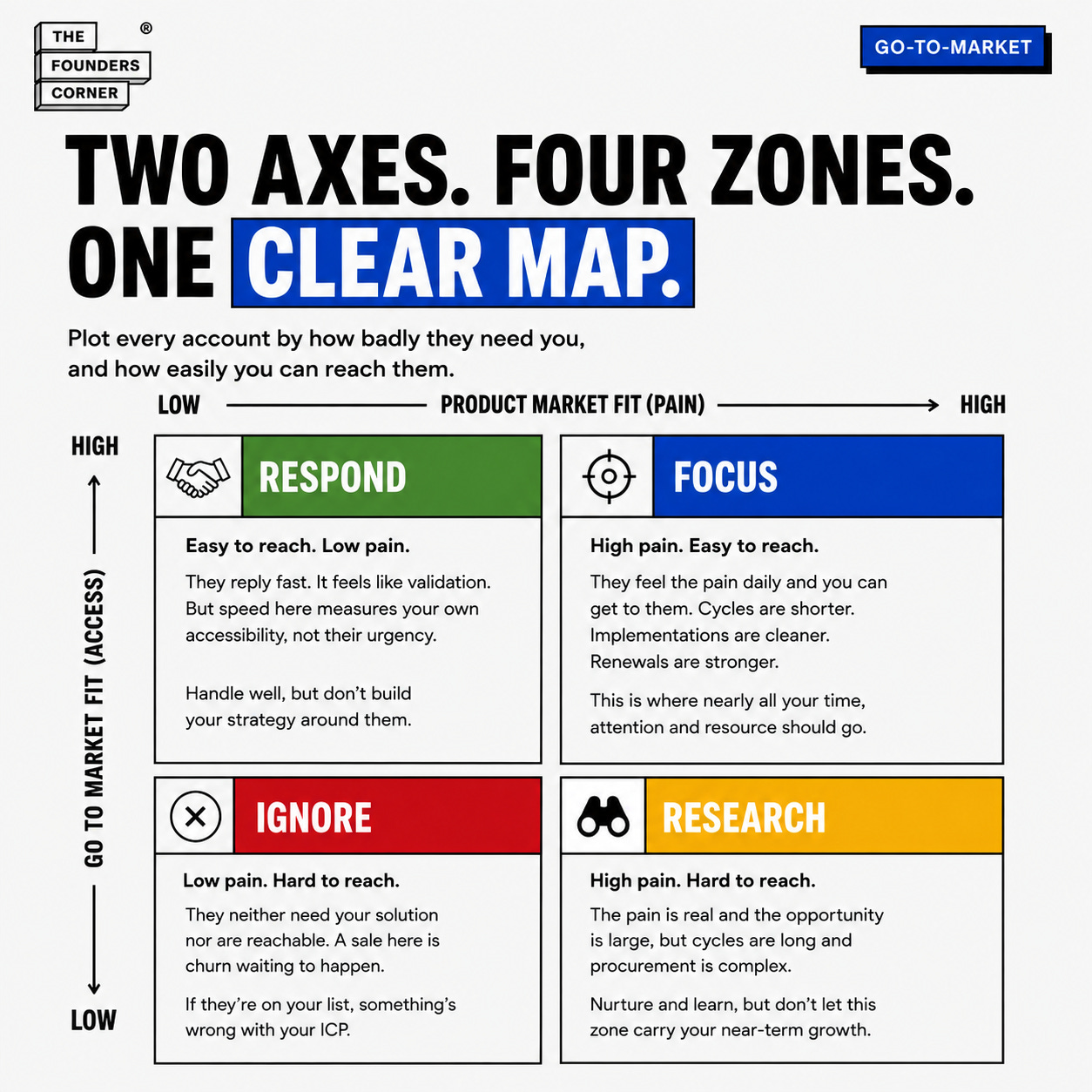
There is a much simpler way to see it. Two axes. Four zones. Plot how badly an account needs you against how realistically you can reach, sell and deliver to them, and suddenly the market looks very different. The uncomfortable part is that your real target market is probably much smaller than the one in your pitch deck. That is exactly why this exercise works.
Table of Contents
A Simple Example: Two Buildings on the Same Street
Two Axes, Not One
The Four Zones
Why the Respond Zone Feels Like Validation
Why the Research Zone Costs the Most
Your Focus Zone Is Smaller Than You Think
Filling In the Grid Honestly
Matching Your Effort to the Grid
A Simple Example: Two Buildings on the Same Street
Picture two buildings on the same street. The first has its door propped open. Reception waves you through, the head of operations replies to emails within a day, and you could be in front of the person who signs inside a fortnight. The only problem is that nobody in there is losing sleep over the thing you fix.
The second building has security on the door, a procurement portal, and a fourteen-month cycle. But every person inside feels your problem daily, and has done for years.
Both look like opportunities on a Monday morning. Neither is where your next twelve months are won. Every account on your list sits somewhere between those two buildings, and the position is set by two things that have almost nothing to do with each other: how badly they need you, and how easily you can reach them.
Two Axes, Not One
Product Market Fit describes how well your product solves a viscerally painful problem for a given customer. It’s high where the pain is acute, persistent and visible, and where your solution removes it in a way that feels natural and complete. These are the organisations that recognise themselves immediately in your messaging and feel genuine relief when they see what you’ve built.
Go to Market Fit isn’t about the product at all. It’s about access and efficiency: how easily you can identify the right personas, reach them through credible channels, hold a meaningful conversation, and carry them through a buying and onboarding process that matches how they actually operate. High Go to Market Fit also tends to mean manageable integrations, proportionate procurement, accessible budget, and early value that arrives fast enough to create advocacy and referrals.
Most founders only ever score the first axis. That’s why the “is this a good account?” conversation goes round in circles. Two people can both be right and still be arguing, because one is talking about pain and the other is talking about access.
Plot both, and the fog lifts. What was a subjective debate about good and bad opportunities becomes an evidence-led map that shows you where to invest and where to step away.
Want to get in front of 250k+ founders and investors?
For sponsorship opportunities across The Founders Corner newsletter and LinkedIn (160k followers), email: founderscornermedia@gmail.com
The Four Zones
Top right, where both are high, is your Focus zone. These customers feel the pain deeply and you can reach them easily. Sales cycles are shorter, implementations are cleaner, renewals are more predictable. This is where momentum lives, and where nearly all your time, attention and resource should go in the early stages.
Bottom right is the Respond zone. Easy to reach, poorly aligned. They come inbound or answer outreach quickly, and it’s tempting to treat that speed as validation.
Bottom left is the Ignore zone. Low fit, low access. They neither need your solution nor are reachable, and a sale here is churn waiting to happen. If you’ve done the Perfect Customer Profile work properly, very little of your list should sit here, but it’s worth naming so the team knows what it looks like.
Top left is the Research zone, and it’s the subtle one. Product Market Fit is high, sometimes enormously so, but reaching the Economic Buyer is hard and the path to purchase is long. Think Walmart in the US, or the NHS in the UK.
Why the Respond Zone Feels Like Validation
Inbound feels like proof. Someone found you without being chased. Someone replied on the first email. Someone booked a call and turned up.
But the signal you’re reading is about your own accessibility, not about their pain. A fast reply tells you the channel worked; it tells you nothing about whether doing nothing is unacceptable for them.
There’s nothing wrong with responding professionally and helpfully to these accounts. The mistake is letting them shape your strategy. They’re opportunistic rather than repeatable, and pursued too aggressively they’ll quietly pull your roadmap, your messaging and your best people away from the customers who actually matter.
If you’re building right now, you’ll need these:
243 Ways to Fund Your Startup Without Giving Up a Share: 243 programmes across 63 regions, and the eligibility gate that quietly disqualifies most applicants.
15 Claude Skills That Run Your Entire Raise: install once, and your story stops drifting somewhere around investor number forty.
The Investors Who Are Actually Writing Cheques In H2: 287 family offices your warm intro list doesn’t know exist.
The Claude Guide Every Founder Should Run Before Fundraising: nine prompts that replicate the screen your deck meets before a partner ever opens it.
How to Build Your Fundraising Narrative with Claude: the five-prompt sequence that puts your story in the order it needs to land, not the order it happened to you.
Why the Research Zone Costs the Most
This is the more expensive mistake, and it’s usually made by the smartest founders in the room. The logic is hard to argue with: the pain is real, the account is enormous, and landing one would change everything.
It might. But decision cycles stretch over many months or years, procurement is complex, and adoption is slow. The quadrant holds genuine future potential, and it’s worth researching, nurturing and learning from. It simply cannot carry your near-term growth. Place your future there too early and you’ll run out of time before you run out of ideas.
Your Focus Zone Is Smaller Than You Think
When teams fill this grid in honestly, the Focus quadrant is almost always smaller than expected. That’s normal, and it’s healthy. Software businesses don’t grow by pursuing breadth; they grow by exhausting depth.
Seeing your accounts distributed across the grid is usually sobering. It exposes how much energy went into deals that felt exciting at the time but were structurally misaligned with how the business needs to scale. That isn’t a reason for regret. It’s evidence of learning, and the point of the exercise is better decisions ahead, not judgement of the ones behind.
Filling In the Grid Honestly
Get the room right first. Sales, Marketing, Product, Tech and Customer Success, phones and laptops off. The diversity of perspective isn’t a risk here, it’s the whole point, and the most useful learning tends to surface in the disagreements.
Ask sales which accounts made it easy to get to the Economic Buyer, and which felt disproportionately hard work. That’s your Go to Market Fit axis, described by the people who lived it. Ask Customer Success where the product delivers value most naturally and where friction persists despite everyone’s best efforts. Ask Marketing which segments respond and which stay stubbornly indifferent.
Bring data where you have it, such as cycle length, onboarding time, product usage and renewal behaviour, but give equal weight to lived experience. The stories your team tells about customer interactions are signals, not anecdotes.
Then capture not only where each account sits, but why. The reasons matter more than the position, and they’re what make the grid useful again in six months when your product and your reputation have moved.
Matching Your Effort to the Grid
None of this is static. Revisit it quarterly and watch the points move as the product matures and new routes to market open up. Success isn’t filling the grid evenly. It’s making the Focus quadrant dense, deliberate and unmistakable.
This is exactly what Builder Step 6 exists to produce: your market map, sorted into focus zones, so you can see at a glance whether your team’s effort is landing where fit is strong and access is real, or drifting into the two quadrants that feel productive and aren’t.
Spend your life where fit is strong and access is real. Everything else can wait.
Selling Software Algorithm Builder, Step 6: Market Map (recreated illustrative mockup based on the tool’s documented output; a fictional example company is shown)
Next in the series, we look at what happens when the algorithm stops being a document and becomes behaviour, and why this is the one piece of work a founder cannot delegate.
-Chris Tottman
Most account lists get sorted by company size or logo appeal, rather than by whether you can actually reach the person who signs.
The Selling Software Algorithm Builder Step 6 generates your market map and sorts your accounts into focus zones, so you can see where your effort is really landing.
Start your 7-day free trial → Cancel anytime.