

A company sitting above 120% Net Revenue Retention has traded at close to three times the valuation multiple of one sitting below 100%, according to Software Equity Group’s SaaS Index.
Both companies could send the exact same investor update.
Growth rate on line one. ARR on line two. A clean logo count trending up.
A reader would have no way to tell which one is worth three times more per dollar of revenue. The number that actually explains the gap almost never makes it into the update at all.
That’s not a reporting gap. It’s a design gap.
Most founder dashboards get built once, in the seed deck, then patched with whatever’s easiest to pull out of Stripe: total users, total revenue, signups this month. Those numbers describe activity. They were never built to answer the one question every investor in the room is actually asking.
Can this business grow without you, or does it need constant new fuel just to hold its shape?

I’ve read this exact panel for a living for two decades. Chief Commercial Officer at MessageLabs before its $700M sale to Symantec, then a co-founder of Notion Capital, backing over 500 B2B founders since.
What follows is the dashboard we run with founders before every raise and every board update. What it measures, why it’s built the way it is, and how to run it in three steps. The full working template is at the end.
What Is the SaaS Metrics Dashboard?
A linked Excel workbook that turns raw ARR, customer, and spend data into eight scored panels: Net Revenue Retention, Gross Revenue Retention, Burn Multiple, Rule of 40, CAC Payback, Pipeline Coverage Ratio, Gross Margin, and a Cohort Retention curve.
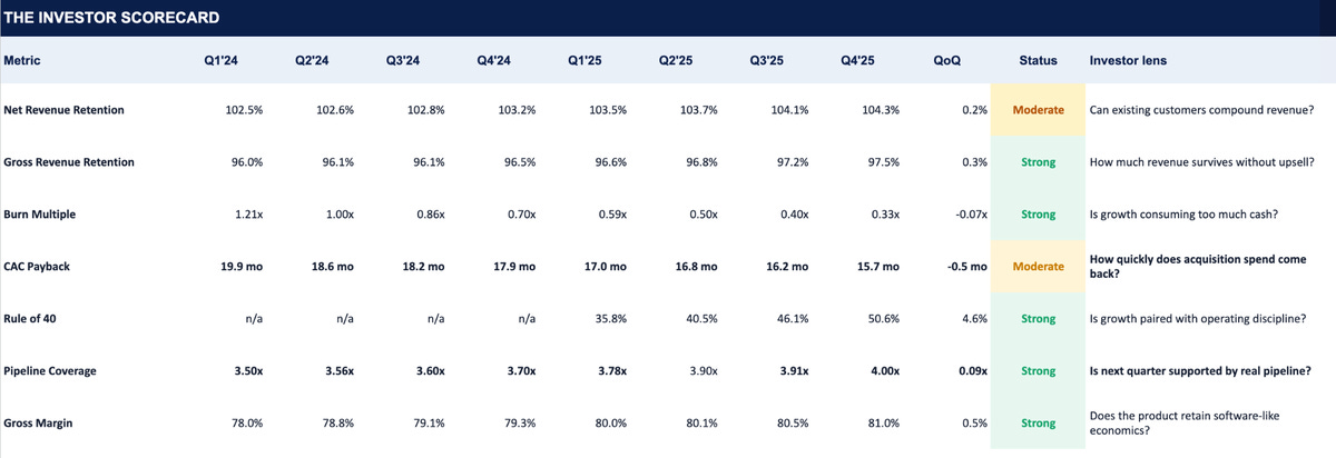
Every panel comes with a Strong, Moderate, or Weak band, sourced from current SaaS benchmark data, not an editorial guess.
Two things separate it from the wall-of-charts dashboard most founders already have.
First, it’s scored, not just charted.
A chart of MRR over time tells you what happened. It doesn’t tell you whether what happened is good.
This dashboard tells you where your 88% GRR or your 1.3x burn multiple actually sits against the current market, without a second spreadsheet open to check.
Second, it’s built to be read in pairs, not in isolation.
None of these eight numbers means much alone.
NRR next to GRR tells you whether retention is real or propped up by upsells. Burn Multiple next to Rule of 40 tells you whether efficient-looking burn is actually efficient, or just what’s left after growth stalled.
A dashboard that shows one half of each pair lets a founder choose which story to tell. A dashboard that shows both leaves nowhere to hide the gap. That’s exactly how investors already read these numbers, whether or not the founder built the dashboard that way.
Want to get in front of 250k+ founders and investors?
For sponsorship opportunities across The Founders Corner newsletter and LinkedIn (160k followers), email: founderscornermedia@gmail.com
Why This Dashboard Matters
Here’s a scenario that plays out more often than founders expect.
A company walks into a partner meeting with NRR at 106%. Clean, above the 100% bar, a number worth leading with.
Twenty minutes in, a partner asks what Gross Revenue Retention looks like on the same base. It’s 79%.
NRR was propping up a 27-point hole with expansion revenue from the handful of accounts that hadn’t already churned. The founder wasn’t lying. They just never put the two numbers on the same page and found the gap themselves, before someone else found it for them in the room.
Or take the burn side.
A team reports a Burn Multiple of 1.1x, comfortably inside the Strong band, a genuinely good number on its own. Run alongside it, Rule of 40 has fallen from 38% to 22% over four quarters.
The burn multiple isn’t efficient. It’s what a good-looking burn multiple looks like when a company has nearly stopped spending and nearly stopped growing at the same time. Read alone, 1.1x is a green flag. Read next to Rule of 40, it’s a stall wearing a good number.
Both are read-in-pairs problems. Both are exactly what a dashboard built from disconnected exports will always miss.
When your NRR lives in a Notion doc, your burn number lives in a founder’s head, and your pipeline coverage lives in whatever your VP of Sales said on the last call, nobody ever puts two of them side by side long enough to notice the gap.
The founder note built into this workbook says it plainly: investors rarely reject a company because one metric is imperfect. They hesitate when the metric is weak, the direction is unclear, and the founder can’t explain the mechanism behind it.
Keeping every panel on one page, scored against the same current benchmarks, updated from the same Inputs tab every quarter, is what makes the pairing happen automatically instead of by accident.
The gap surfaces before an investor finds it for you.
The Eight Panels, and What Each One Actually Tells You
Here’s what’s actually on it, using the sample data built into the template so you can see it working before you touch a single cell.
Net Revenue Retention. Can existing customers compound revenue on their own, without a single new logo?
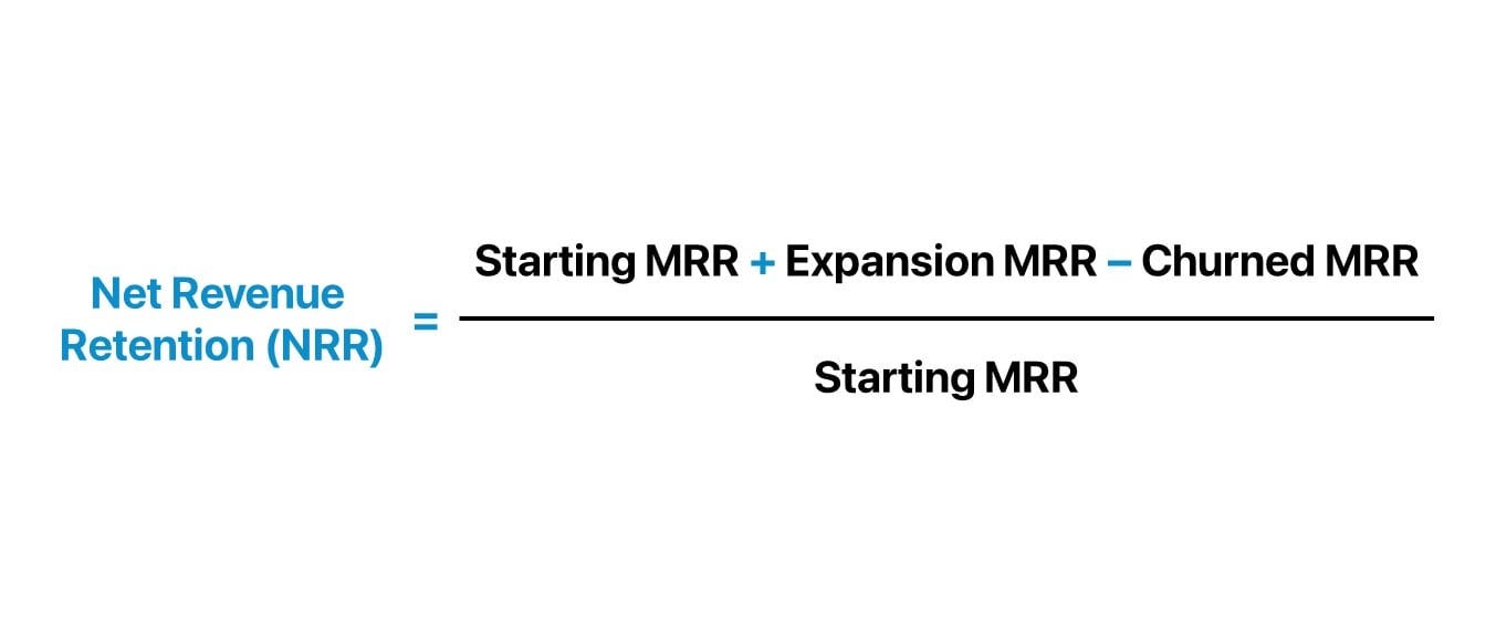
Anything at or above 105% tells an investor your product sells itself into your own base. In the sample data, NRR moves from 102.5% to 104.3% across eight quarters. Real progress, landing in the Moderate band rather than Strong.
Not a failure. A specific, answerable question for your next update: was the improvement expansion revenue, or just less churn?
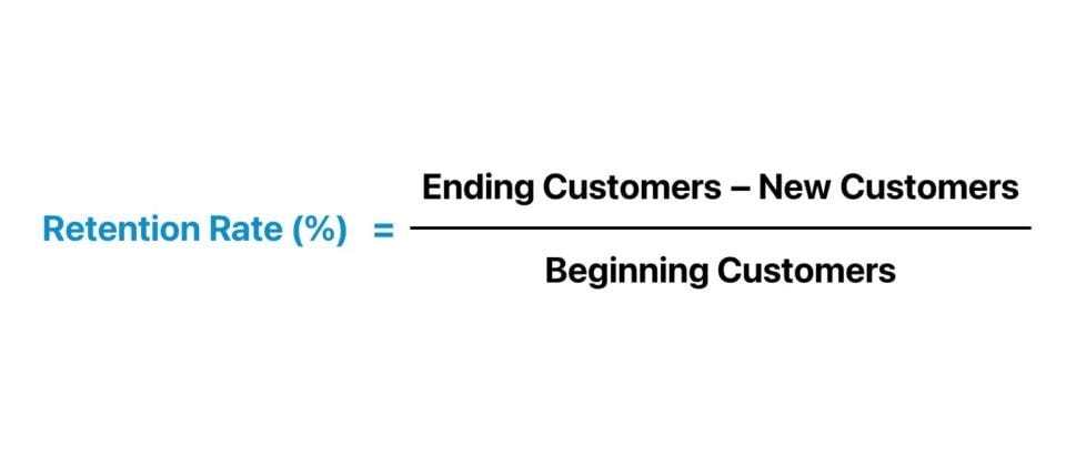
Gross Revenue Retention. NRR’s stricter sibling. It strips out upsell entirely and asks how much revenue survives with zero expansion.
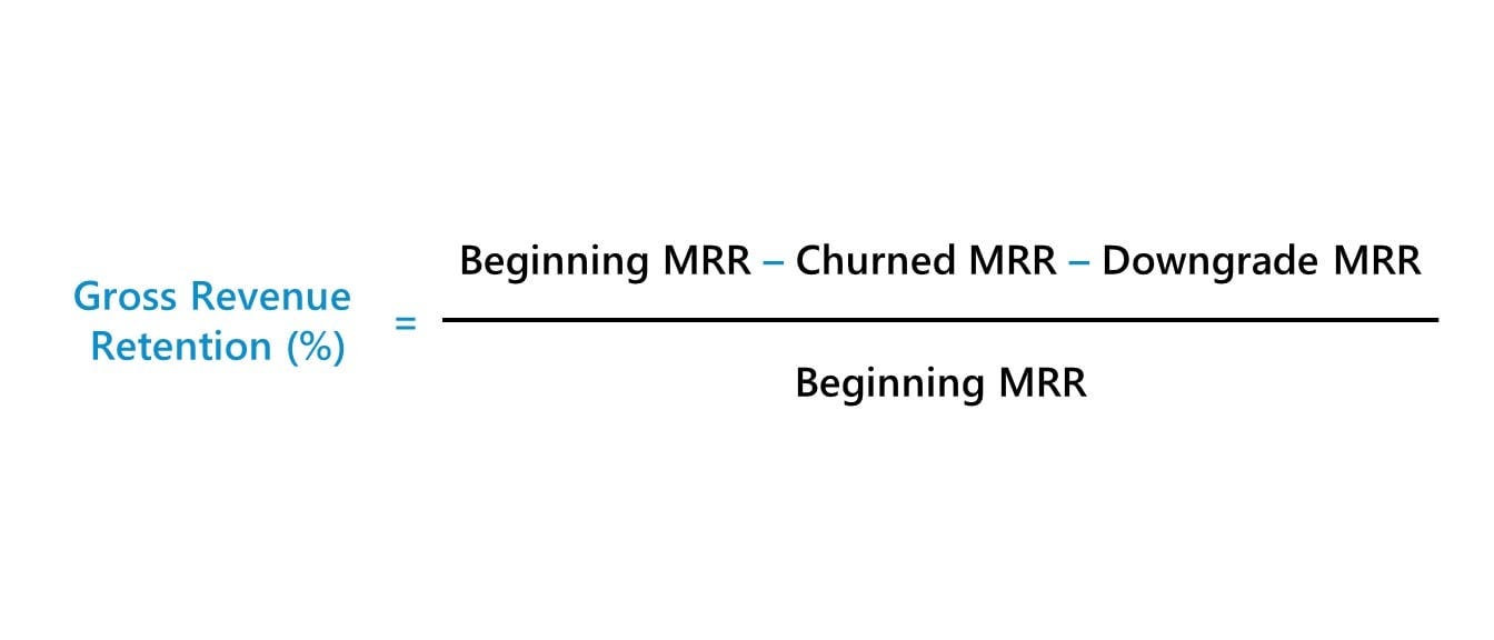
A 2025 benchmark survey puts the median around 88%, with anything below 85% usually signalling a product market fit or customer success problem.
In the sample, GRR climbs from 96.0% to 97.5%. Comfortably Strong, and it’s the number that makes the NRR story credible rather than lucky.
Burn Multiple. Decides whether your growth is efficient or expensive. Simply, how much cash you burned for every net new dollar of ARR.

The framework popularized by SaaS operator David Sacks treats anything under 2.0x as defensible, with top quartile companies running 1.0 to 1.2x.
In the sample, Burn Multiple falls from 1.2x to 0.33x over eight quarters. The single biggest swing on the page, and exactly the kind of trend line that gets an investor to stop reading your update and start drafting a follow-up question of their own.
CAC Payback. How many months it takes acquisition spend to come back.
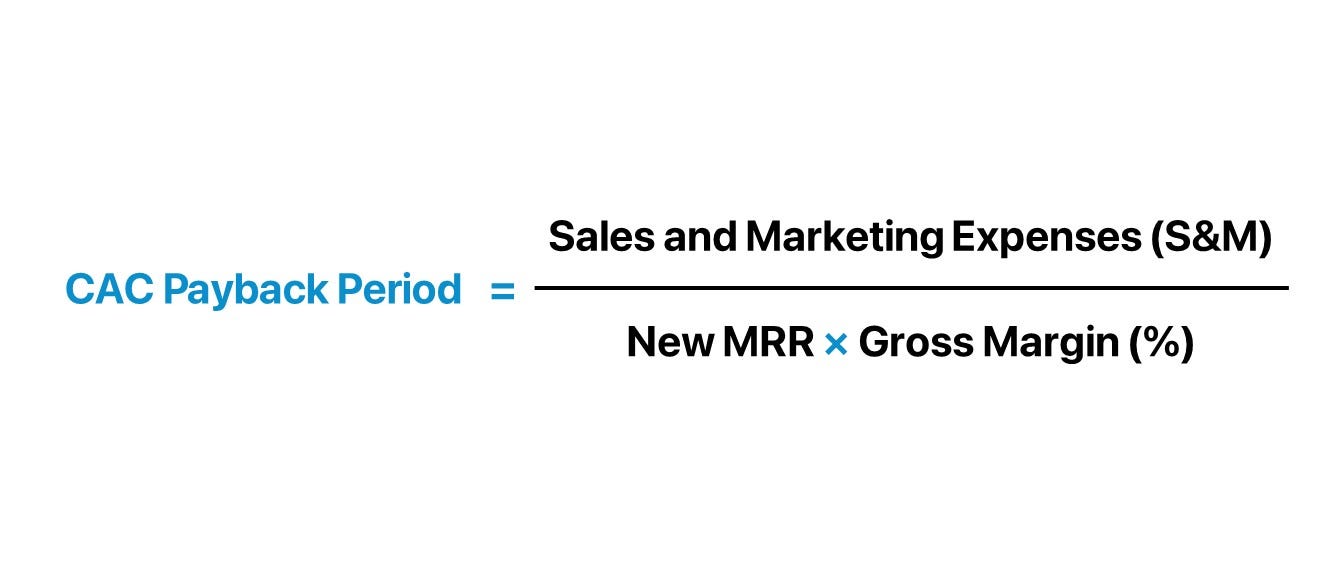
Median sits at 16 to 18 months; investors push for under 12. The sample improves from 19.9 to 15.7 months. Real movement, still short of Strong.
Rule of 40. Does growth rate plus profit margin clear the bar, or is one quietly propping up the other?
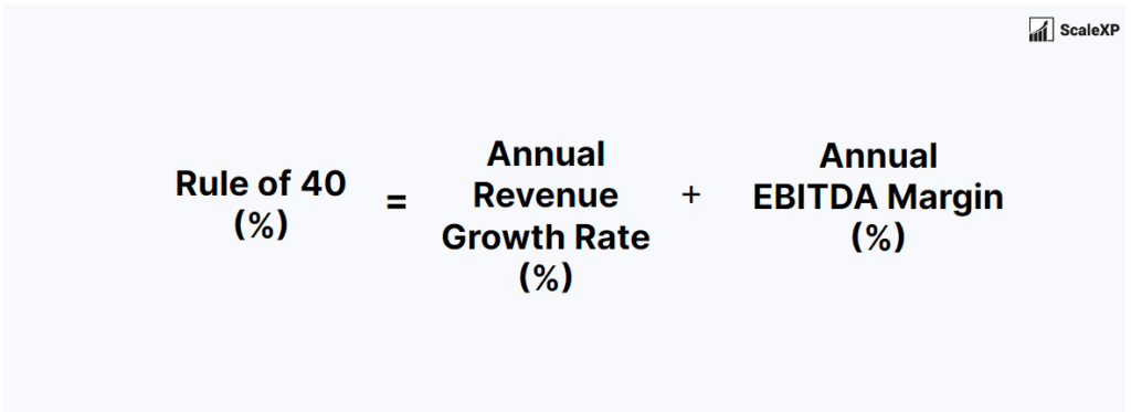
The sample crosses from n/a (too early to score) to a Strong 50.6% once four quarters of comparable data exist. That’s itself the point: this panel isn’t meaningful until you have the history behind it, and the workbook is built to say so rather than show you a number that isn’t ready.
Pipeline Coverage Ratio. Is next quarter’s target backed by real, weighted pipeline, or by hope?

The sample runs from 3.5x to 4.0x against a 3.5x Strong threshold, sourced from standard B2B sales-ops benchmarking.
Gross Margin. Does the business still run on software economics, or have services crept in and diluted it?
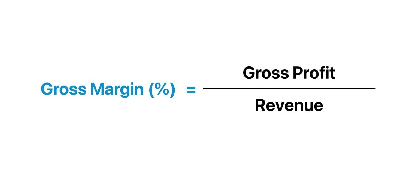
The sample climbs from 78.0% to 81.0%, against a market median of 80%.
Cohort Retention. The one panel that isn’t a single number. It’s a curve.
A cohort-by-cohort grid tracks whether each vintage of customer becomes more valuable as it ages, or quietly leaks ARR the whole way through, something a single blended NRR figure can hide completely.
In the sample, the Q1’24 cohort climbs from 100% at signing to 114% by age five. That’s a company getting paid, in the literal sense, for keeping a customer alive rather than for closing them in the first place.
What’s Inside the Workbook
Six tabs. Each one does a single job.
Start Here. The color legend: blue text you fill in every quarter, black text that recalculates on its own, yellow fill marking the exact cells to overwrite. Plus a four-step checklist for your first pass through the workbook.
Why it matters: the fastest way to break a linked workbook is typing over a formula by accident. This tab keeps you inside the cells that are actually meant to be touched.
Inputs. The only tab you open every quarter. Your ARR bridge (beginning ARR, new ARR, expansion, contraction, churn, ending ARR), customer counts, revenue and COGS, sales and marketing spend, net cash burn, and pipeline versus target. Eight quarters, ready to extend.
Why it matters: every panel on the Dashboard tab pulls straight from these rows. Get the ARR bridge right once, and NRR, GRR, Burn Multiple, and Rule of 40 all compute correctly without you touching another cell.
Dashboard. All seven scoreable panels, side by side, pulling live from Inputs, each with a color-coded status and a QoQ delta.
Why it matters: this is the page you screenshot into a board deck. Update Inputs, and every panel and every status color update themselves. No manual recalculating before a meeting.
Cohort Retention. Panel eight, on its own tab, because it isn’t a single number. A triangular grid tracks each acquisition cohort’s ARR retention by quarter-age, with an average row showing whether the product gets stickier or leakier as customers age.
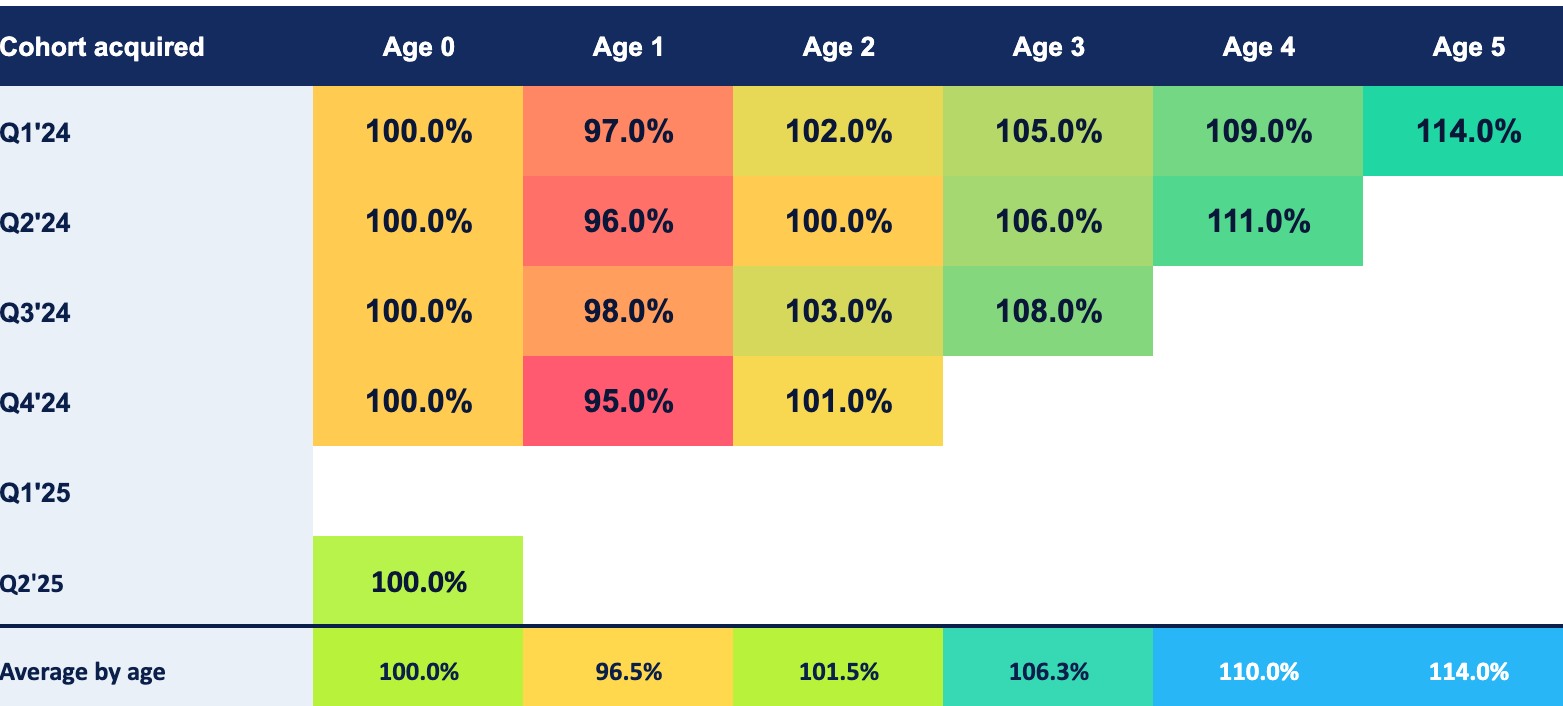
Why it matters: a blended NRR figure can hide old cohorts compounding nicely while every new cohort churns faster than the last. This is the only panel built to catch that specific failure.
Benchmarks. Every Strong, Moderate, and Weak threshold on the Dashboard tab, sourced.
Why it matters: a benchmark you can’t source is an opinion with better formatting. Check where every band came from and cite it yourself in your next update.
Claude Prompt. A paste-ready prompt that takes a raw Stripe or billing CSV, reconciles your ARR bridge, flags anomalies, and asks you directly for the four numbers that don’t live in a billing export (sales and marketing spend, cash burn, pipeline, bookings target) instead of guessing at them.
Why it matters: most founders don’t have forty minutes a quarter to hand-build an ARR bridge from a CSV. A prompt that estimates those four numbers instead of asking produces a dashboard that looks complete and is quietly wrong on half its panels.
How to Use It (3-Step Workflow)
Step 1: Drop your numbers. Open Inputs and replace the sample data with your own ARR bridge, customer counts, revenue, spend, and pipeline, one quarter at a time.
Cause and effect: move Churned ARR from $25K to $45K in a single quarter, and NRR drops from 105% to 97%, flipping from Strong to Weak on the Dashboard tab instantly. The same change a partner would clock in about four seconds in a board meeting.
Step 2: Read the panels in pairs. Check the Status column first. Anything Yellow or Red is worth a sentence in your next update, before an investor asks. Then check the trend, since one quarter’s Strong score matters less than whether the line has been climbing or sliding for the last four.
Cause and effect: a Burn Multiple that reads Strong at 1.1x this quarter, next to a Rule of 40 that’s fallen from 38% to 22% over four quarters, tells you the efficiency is coming from spending less, not spending better. That’s a different conversation with your board than “burn is under control.”
Step 3: Decide, then share. Use the panels to decide what actually needs to change: whether a hiring plan survives the burn multiple it implies, whether a price change is worth the CAC payback hit, whether pipeline coverage supports the number you’re about to promise a board. Export the Dashboard tab straight into the update.
Cause and effect: Pipeline Coverage sitting at 2.3x against a 3.5x target tells you, three months out, that hitting next quarter’s number needs either more pipeline or a lower target. A decision that’s far cheaper to make now than the week the quarter actually misses.
Who Should Use It, and When
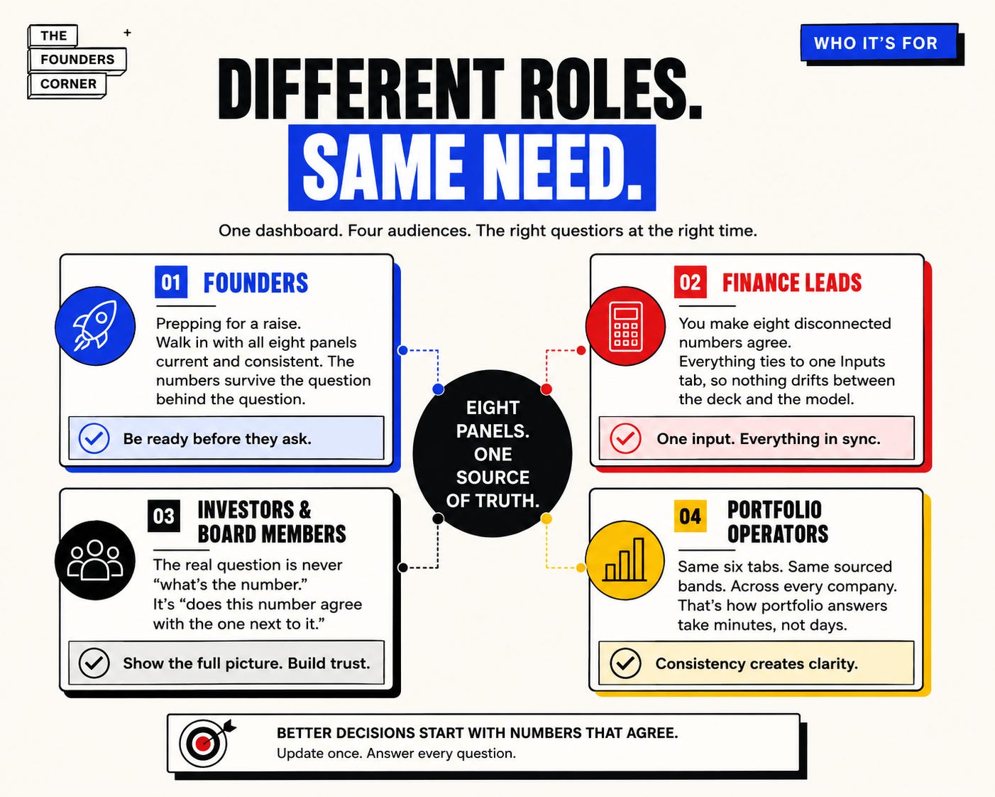
Founders, prepping for a raise. Due diligence isn’t the moment to discover your own GRR for the first time. Walk in with all eight panels current and internally consistent, and the numbers survive the question behind the question, which is never “what’s your NRR” but “does that agree with everything else on the page.”
Fractional CFOs and finance leads. You’re the one who has to make eight disconnected numbers agree before they reach a founder’s desk. This keeps the ARR bridge and every downstream metric tied to one Inputs tab, so nothing quietly drifts out of sync between the deck and the model behind it.
Investors and board members. The real question is never “what’s the number.” It’s “does this number agree with the one next to it.” A founder who hands you all eight panels, sourced, has already done the work of checking their own story before asking you to believe it.
Portfolio operators. Same six tabs, same sourced bands, across every company you touch. That’s the only way “how’s the portfolio doing” gets answered in minutes instead of a week of chasing spreadsheets.
If You’re Prepping an Update Right Now, Don’t Stop Here
This dashboard tells you what to say. These tell you how the room on the other side of it actually thinks:
The Number That Kills More Fundraises Than Any Bad Idea: one slide, one metric, quietly killing raises before founders even notice.
The Quiet Filter That Decides Your Entire Fundraise: every investor runs this before you open your mouth.
The Way VCs Actually Calculate Your Valuation: they have a number in their head before you walk in.
How Investors Decide If You’re Ready to Raise: it’s not timing, it’s not luck, it’s a checklist.
Read those alongside this dashboard and you’re not just sending better numbers. You’re sending them to a reader you actually understand.
Get the Full Workbook
We don’t gate write-ups of numbers you could Google.
We gate the operator-grade tools. The ones that save you a weekend of spreadsheet wiring and make your next investor update look like it came from a CFO, not a founder guessing at what “good” means.
Everything above lives in one workbook, ready to download:
All 8 panels: NRR, GRR, Burn Multiple, Rule of 40, CAC Payback, Pipeline Coverage Ratio, Gross Margin, and the Cohort Retention curve, each with an investor-lens question and a QoQ delta
The sourced Benchmarks tab, so every band is checkable, not asserted
Eight quarters of working sample data, so every formula and chart runs correctly before you touch a single cell
The paste-ready Claude prompt, ready to turn a raw billing export into a completed Inputs tab in one pass
Excel and Google Sheets compatible, yours to keep and refill every quarter
Every past and future proprietary template, model, and swipe file we publish, plus early access to new frameworks before they go out to the free list
If you’ve got an investor update due this quarter, this is the issue to upgrade on. One dashboard that makes your numbers legible is worth more than a year of Premium if it buys you one fewer awkward follow-up call.
Paid subscribers also get:
✓ 60+ additional tools covering every other stage of fundraising and running a company: pitch deck screening, investor research agents, due diligence, term sheet analysis, and data room management.
Start your 7-day free trial → Cancel anytime.
👉 Download the Full 8-Panel SaaS Investor Dashboard
No guessing at thresholds. No rebuilding your ARR bridge every quarter by hand. Just the scorecard investors are already keeping in their heads. Now it’s yours too.